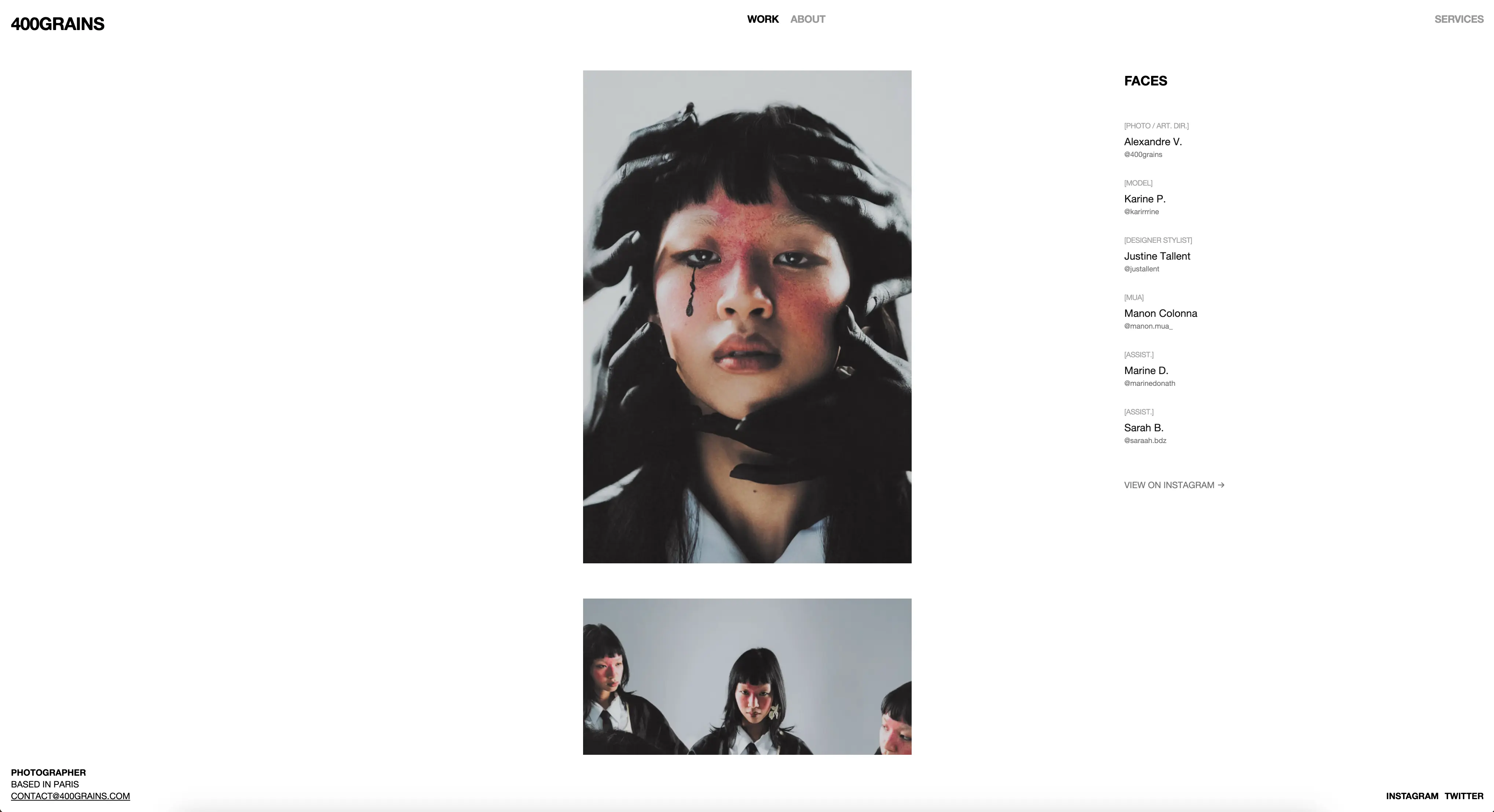
400grains is my minimalist photography website designed specifically for mobile viewing, as it’s primarily accessed through my Instagram page. The name “400grains” pays homage to film photography and the characteristic grain structure that defines analog photography’s aesthetic.
Project Overview
Built with performance and mobile experience as top priorities, this website serves as a streamlined digital gallery that loads instantly and provides an optimal viewing experience on smartphones. The minimalist design ensures that photographs remain the focal point while delivering exceptional performance.
Key Features
- Mobile-First Design: Optimized primarily for Instagram traffic and mobile viewing
- Lightning Performance: Extensive image optimizations including preloading, compression, and modern formats
- Smooth Animations: GSAP-powered transitions and interactions for enhanced UX
- SEO Optimized: Structured data and meta optimization for better discoverability
- Instant Loading: Aggressive caching and optimization strategies
- Responsive Layout: Seamless experience across all device sizes
- Minimalist Interface: Clean, distraction-free design that showcases the photography
Tech Stack
- Framework: Astro (for optimal performance and static generation)
- Styling: Tailwind CSS for utility-first responsive design
- Animations: GSAP (Green Sock Animation Platform) for smooth transitions
- Deployment: Vercel for global edge deployment
- Image Optimization:
- Astro’s built-in image optimization
- WebP/AVIF formats with JPEG fallbacks
- Responsive images with srcset
- Preloading critical images
- Lazy loading for below-the-fold content
- Performance Features:
- Static site generation
- Minimal JavaScript bundle
- Optimized Core Web Vitals
- Edge-cached delivery
Mobile-First Approach
Since the website is primarily accessed through Instagram stories and bio links, every aspect is optimized for mobile users:
- Touch-friendly navigation
- Optimized image sizes for mobile screens
- Fast loading on slower mobile connections
- Thumb-friendly interaction patterns
- Minimal data usage
Performance Optimizations
The website employs aggressive optimization techniques:
- Image Compression: Multi-format serving with Astro’s automatic optimization
- Preloading: Critical images loaded before user interaction
- Caching: Strategic caching for repeat visitors
- Bundle Size: Minimal JavaScript footprint using Astro’s architecture
- CDN: Global content delivery via Vercel’s edge network
Live Website
Visit 400grains.com to experience the mobile-optimized photography portfolio.